Case Study: The Photographer's Gallery
As part of my Product Design course, one assignment was to propose design optimisations for a website of our choice.
The Photographer’s Gallery, based in London, UK, showcases photography exhibitions and artist events, using their website to provide event and exhibition information, book tickets, and sell merchandise.
I chose to focus this assignment on the ticket booking flow and how it uses accessibility and language, given the amount of tourists that visit the gallery.
It is confusing to know whether you need to book a ticket for an individual exhibition or general entry
Any CTA button to book a ticket, from all paid exhibitions, takes the user to a screen where the calendar is too small and the spacing is squeezed, which is not accessible.
Selecting ticket type is too small. The text underneath the title is confusing, it is still unclear whether this is for one exhibition or the gallery. The user has to read the whole list before confirming which ticket they can buy which is time consuming.
The select time is a drop down, rather than available times. The user cannot see straight away which times are available which may confuse them. It also comes after ticket type rather than date, which feels clunky.
The user, before checking out, also has to set up an account and cannot complete guest checkout, making the process very time consuming.
The payment details screen is very small and the text at the bottom is plain text with no branding, which can cause trust issues.
Analysis of existing design of ticket booking user flow
So, what's the goal?
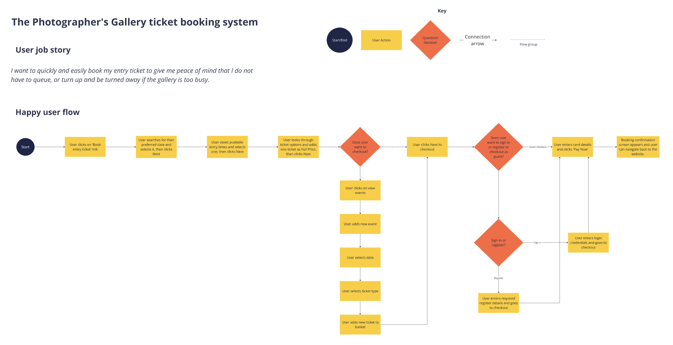
The main issue identified was the clunky flow and the lack of the guest checkout, to minimise time spent booking a ticket. Therefore, using the Jobs-to-be-done framework, the ultimate goal/need for users in this case study was:
"As a potential visitor who is trying to visit the gallery, I need to book a ticket for a specific date and time using guest checkout"
Usability testing plan
Two participants took part in the usability test, which consisted of a short background interview, going through the existing website booking ticket flow, and closing up which some follow up questions regarding the tasks. Consent was acquired before the interview and tests began.
Interviewing
Do you go to art galleries?
Do you often go to see something specific, or just turn up?
How do you buy tickets?
Why do you want to book a ticket online?
When you book online, how far in advance do you tend to book?
Do you tend to browse first, or do you tend to visit the website when you know what you want to see?
Do you normally pay for exhibitions or prioritise free ones?
Tasks
Book a ticket for yourself to see an upcoming exhibition (not a free one). Get to the payment page but do not enter details/complete payment.
Try and add a new exhibition ticket to your basket.
Find general information on ticket prices.
Follow up
What were your general thoughts about the tasks?
Was it easy?
Did you understand what you were booking?
Results
The participants that took part in the guerilla usability tests were culturally engaged, curious, and enjoyed art. They would frequent art galleries both in London (their home) and abroad, making them tourists as well. While they had these similarities, Participant 1 was more spontaneous and didn’t book online often, whereas Participant 2 was more of a planner and would seek to research and buy tickets online.
Neither realised that one ticket grants access to all exhibitions on the same day.
Both found pricing unclear or misleading.
Both found it a confusing flow in terms of structure of the process of booking.
Both noted poorly structured ticket options where concession options were confusing.
Both noted they cannot return to Home by pressing logo.
Both found it a confusing and long-winded sign in process which disrupted flow.
Participant 2 felt some elements were misleading, i.e. that ticket prices are displayed incorrectly.
Participant 1 noted visual inconsistency in each step in terms of button placement, etc.
Ideation: Low-fidelity wireframes
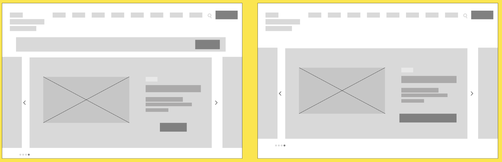
Homepage: changing the position of the main CTA (book ticket)
Selecting a time: moving CTA buttons and time formats
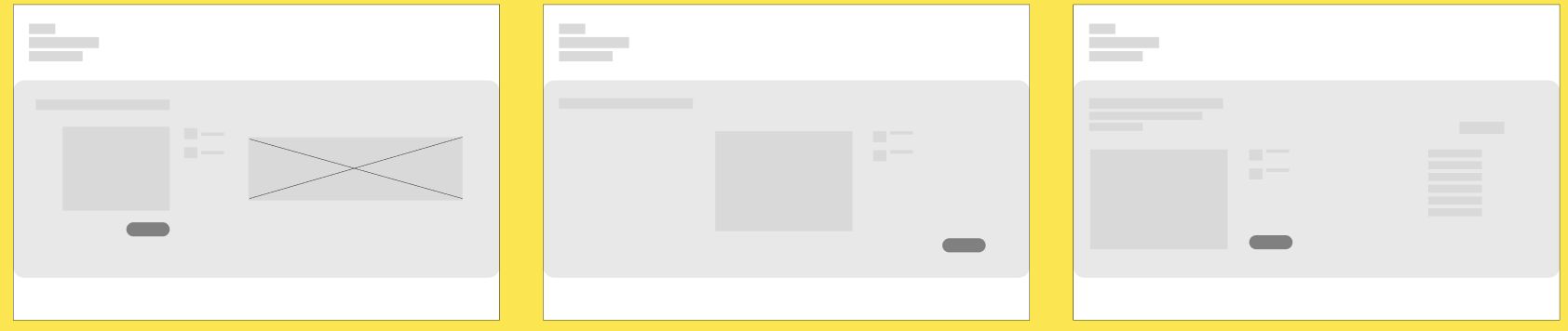
Selecting a date: changing the position of the calendar, imagery, and information)
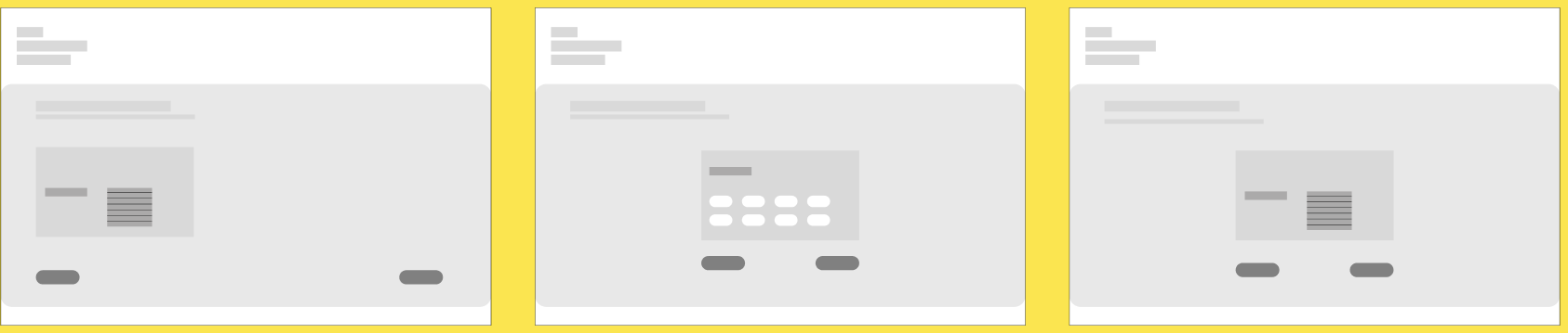
Selecting a ticket type: exploring how to show users the different ticket types and prices

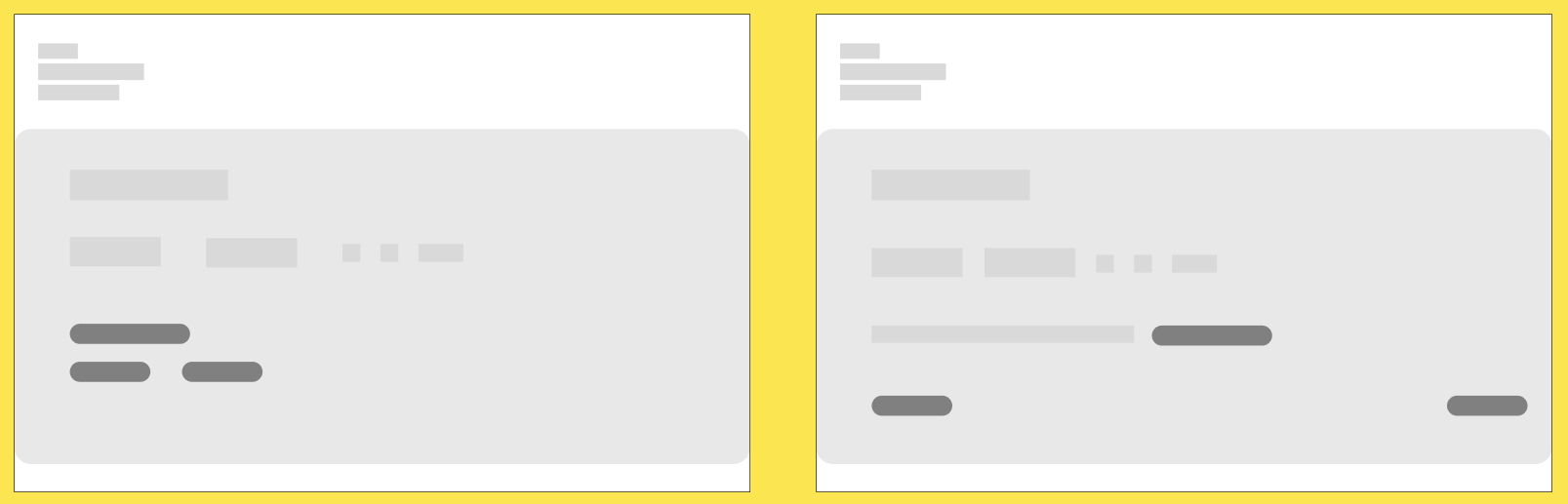
Basket summary

Checkout as guest
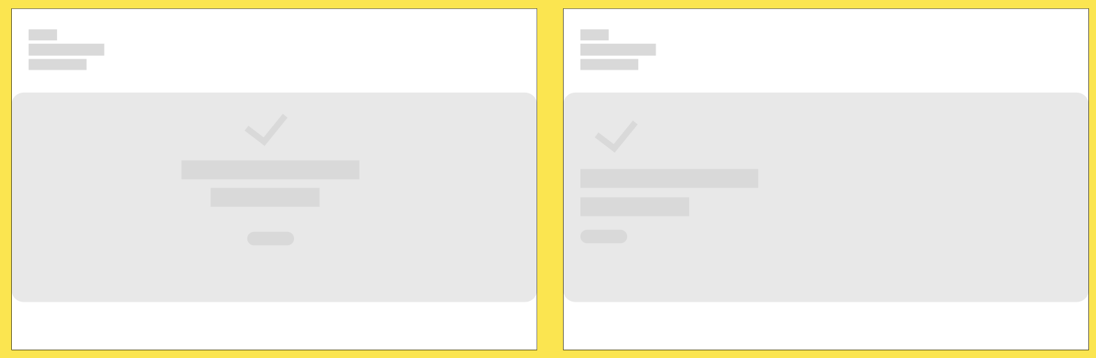
Confirmation screen
User flow
The below user flow was created to further illustrate the happy/ideal task process for booking an entry ticket online, identifying user decisions at each relevant step.