HabitHero: helping users monitor progress towards their fitness goals
The majority of my course (bar the Employer Project) focused on improving one specific part of a fictional fitness app. The three mini-courses (described as phases in this case study) developed my fundamental knowledge and skills and helped me gain applied project experience in product design. It also helped me gain skills to research, collaborate and design effective digital solutions that placed users at the centre.
The problem statement was:
'Users of HabitHero struggle to effectively track and measure progress towards their goals, leading to a lack of motivation and difficulty in achieving desired outcomes.
The current version of HabitHero fails to adequately provide users with the tools and feedback necessary to accurately monitor their progress towards their goals, resulting in frustration and disengagement.’
PHASE 1
Hypotheses
I built these hypotheses after analysing the problem statement and the existing minimum viable product. They provided the building blocks towards my user research and design solutions.
H1: We believe users want to be shown their progress towards their goals in a visually clear way. Therefore we think that adding graph visuals to show activity high and low points will result in an increase in user retention as they have dynamic progress tracking.
H2: We believe users want to add more information to create a bigger picture of health and goal success. Therefore we think that adding further tools such as e.g. what activity they did and more options of goals when setting up the account will result in an increase in user acquisition and retention.
H3: We believe users want to have further autonomy over their goals and edit as needed, based on their performance and life commitments. Therefore we think that a goal check-in such as a questionnaire, developed from goal performance insights, will result in an increase in user retention.
H4: We believe users may not want to track calories or BPM as it could be damaging to mental health; or, they find steps and distance too similar. Therefore we think that providing more flexibility with and choice of fitness metrics will result in an increase in user retention.
H5: We believe users feel de-motivated and frustrated if they have to figure out what the app is telling them. Therefore we think that improving UI and consistency will result in an increase in user acquisition and retention.
User research
I conducted 5 interviews to gain user insights into the fitness app's context within the market and how people use fitness apps in general. I also asked them to evaluate the MVP. Draft questions included:
Do you currently use any fitness apps? If so, please tell me about them. If not, why?
Do you have any fitness goals?
How does setting goals work for you?
What information about your lifestyle do you think is relevant to achieving any fitness goals?
How do you measure your health goals?
Look at this prototype. Please let me know your thoughts.
User persona and user journey map
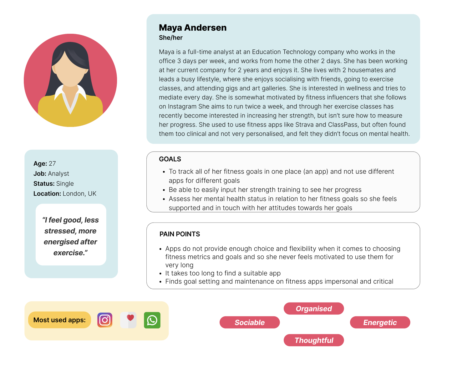
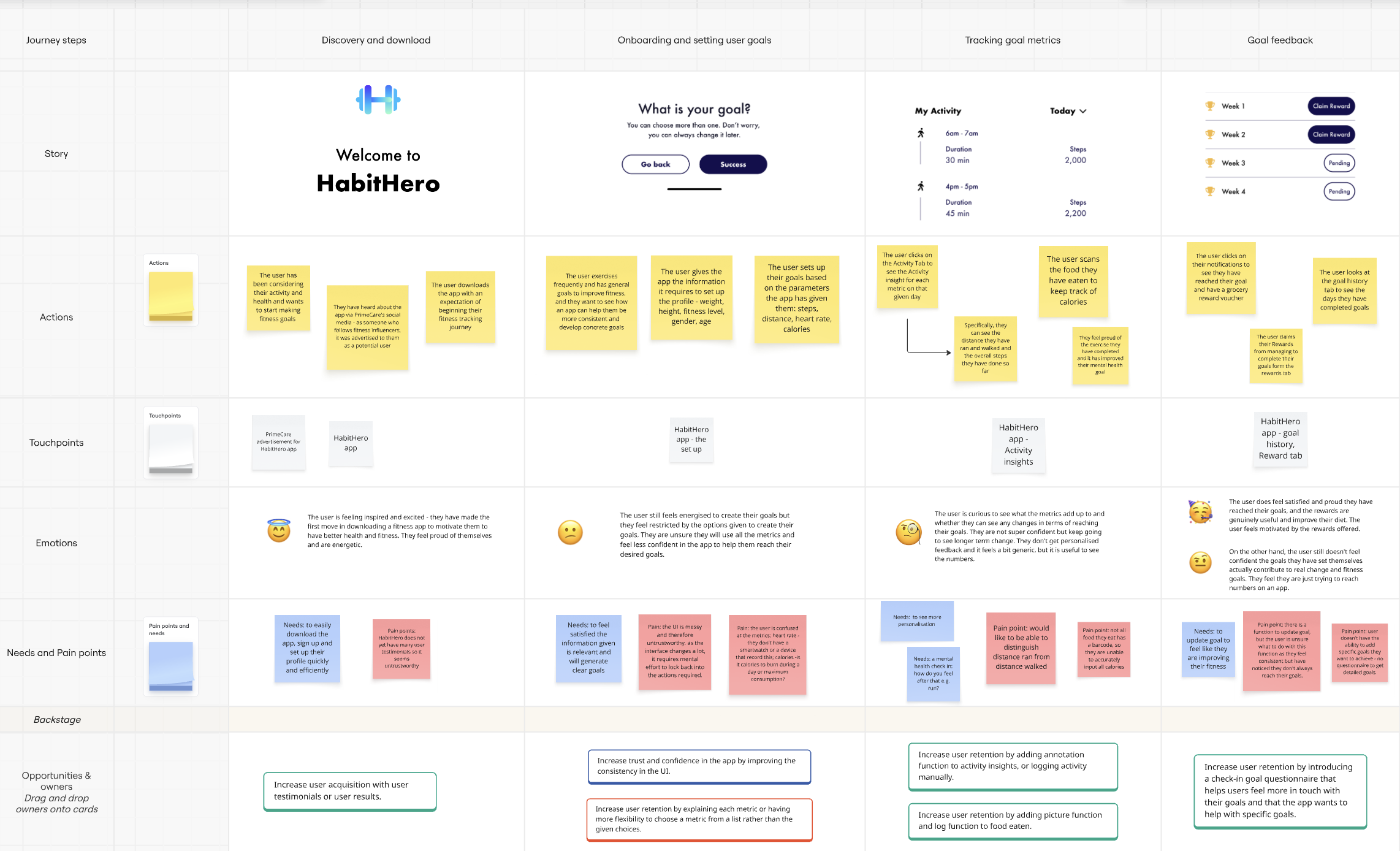
As a result of the interviews I created a user persona with a user journey map. The user persona was a healthy professional, where exercise was a primary motivation for good mental health. This primary finding was to be the basis of the new proposed feature.
New problem statement:
Users of HabitHero struggle to effectively track and measure progress towards their goals in a personalised and mental-health focussed way, leading to a feeling of pressure to meet the numbers rather than for their own benefit, leading to a lack of motivation and hesitation in achieving desired outcomes.
The current version of HabitHero frustrates users due to the lack of flexibility when it comes to setting goals and metrics, with subsequently no goal feedback, resulting in disengagement due to lack of focus on personalisation.
Phase 2
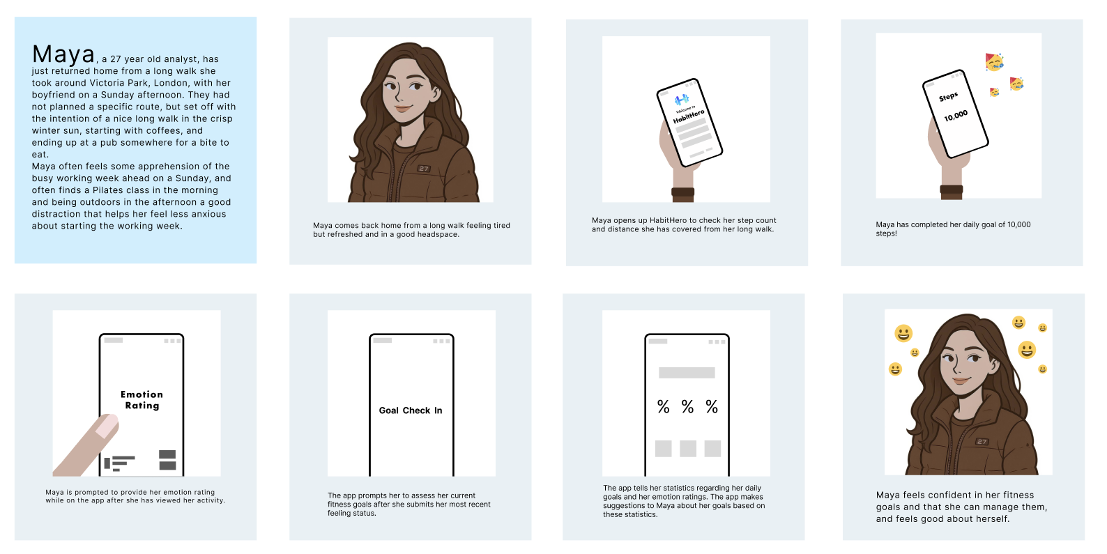
Visualising a storyboard
User flows
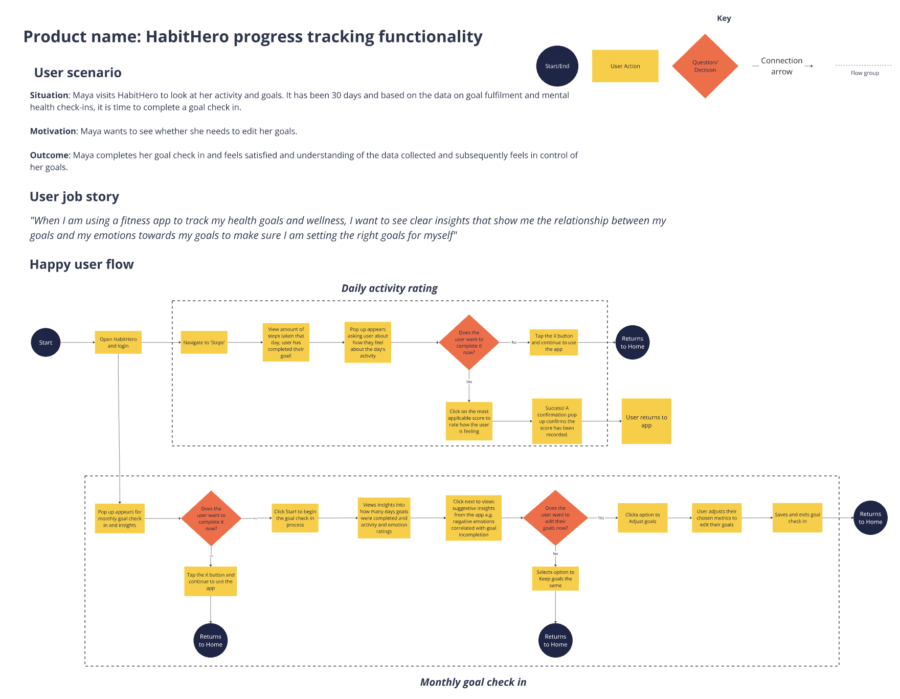
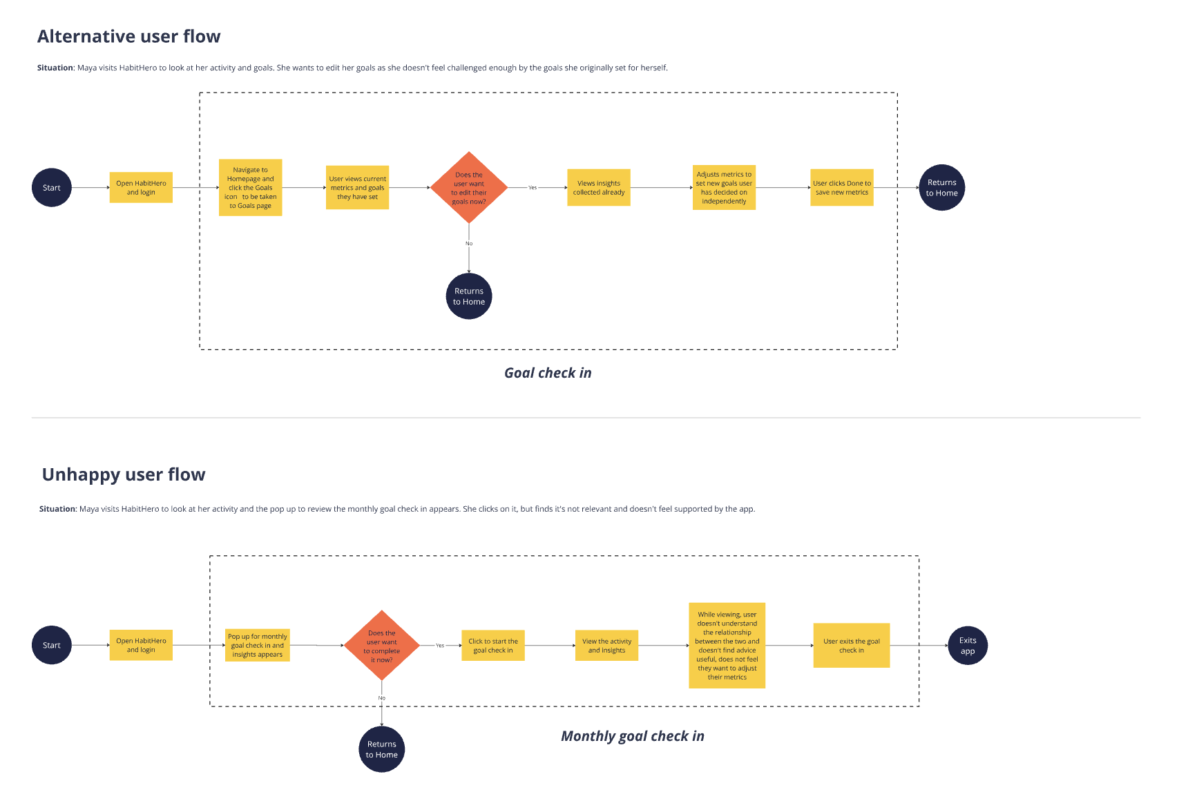
Happy, alternative, and unhappy user flows were created to provide comprehensive coverage of all possible user interactions with the proposed design solution.
Low-fidelity ideation
The ideation process consisted of pen-and-paper drawings and Figma frames to come up with visual solutions to the design problem and incorporating my idea of a mental health check-in and emotion-rating assisted goal setting.
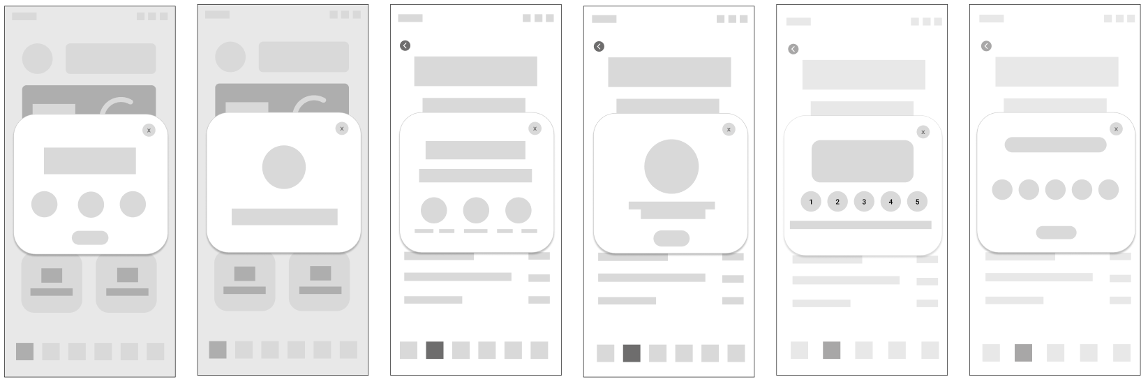
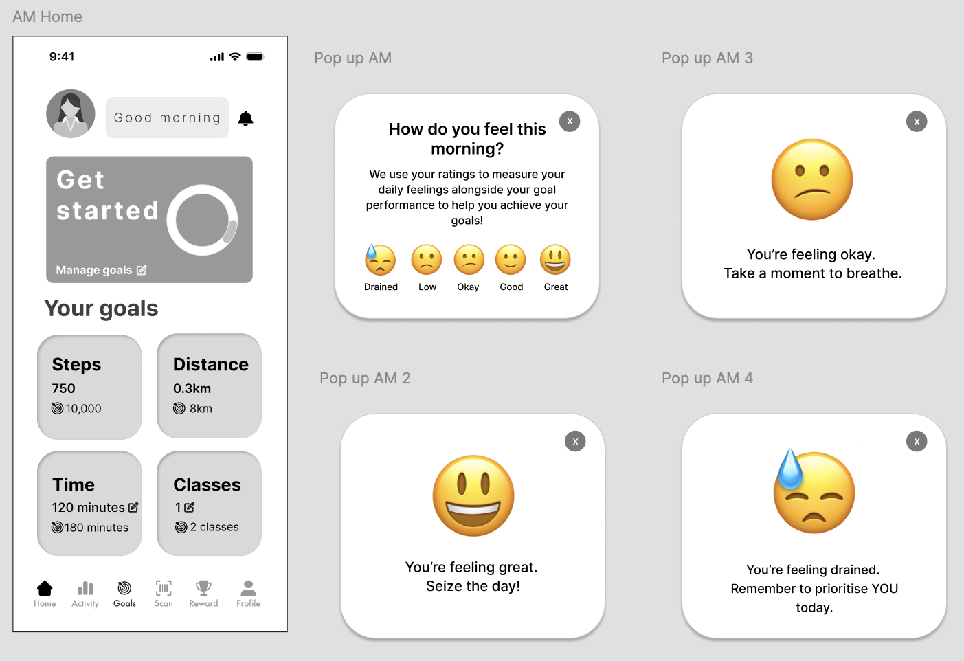
The emotion rating pop up, that would appear in the AM and PM
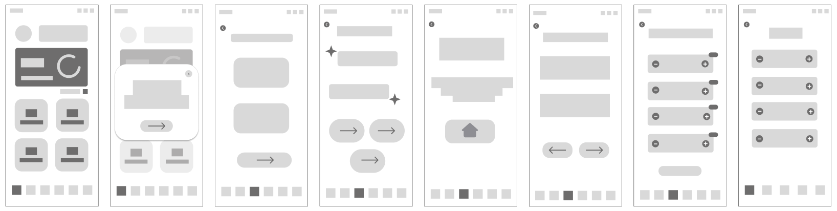
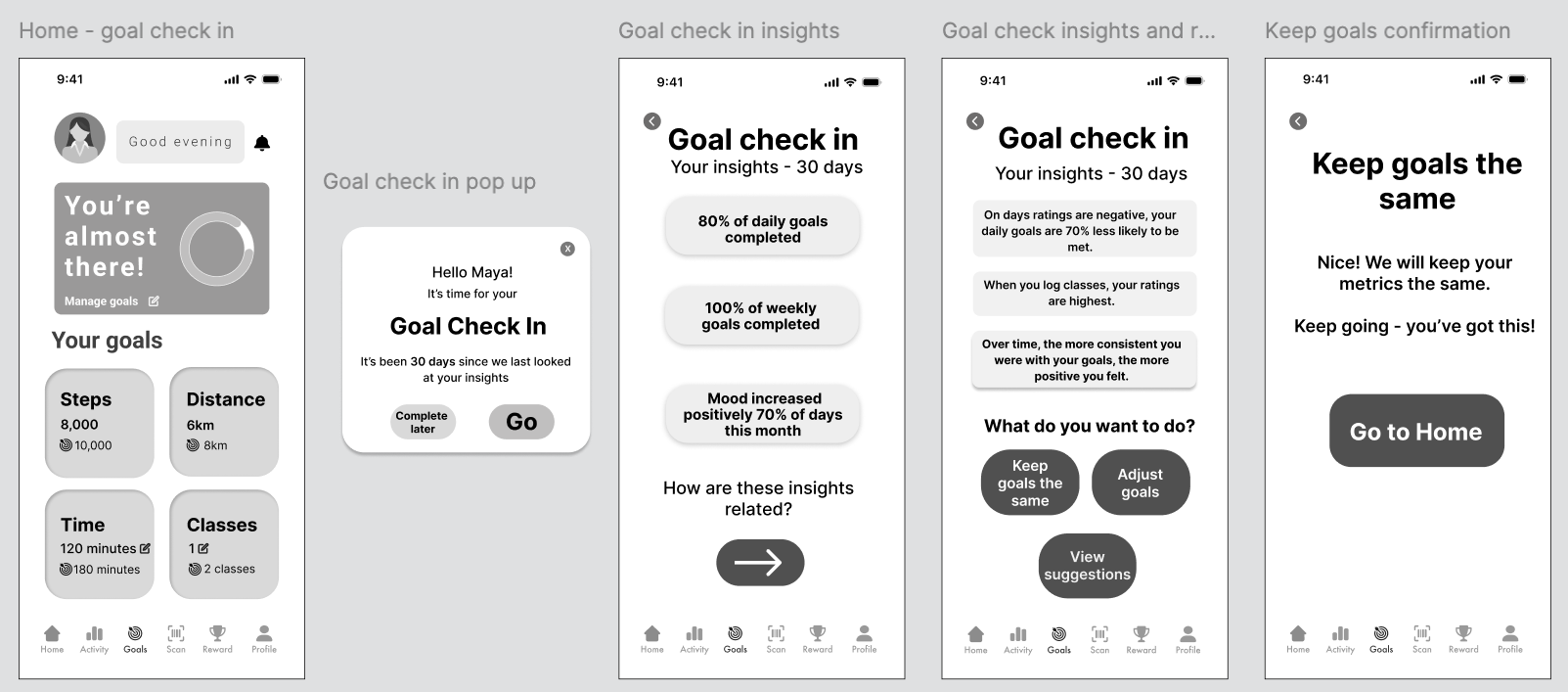
One suggestion of the whole goal check in process, from insights to adjusting goals based on suggestions from the app
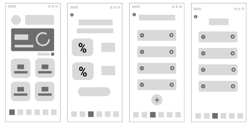
A second, simpler suggestion of the whole goal check in process, from insights to adjusting goals based on suggestions from the app
Mid-fidelity designs for usability testing and improvements
After the ideation process, selected designs were chosen to be used for usability testing. They were then refined based on a simple emotion rating with a clear scale, and a more thorough goal check-in. The designs below are results from usability testing feedback, where main issues arose from wording (goals instead of plans; too much text on homepage); adding more emojis to the pop up scales (as the original three was too reductive); and making UI elements more consistent.
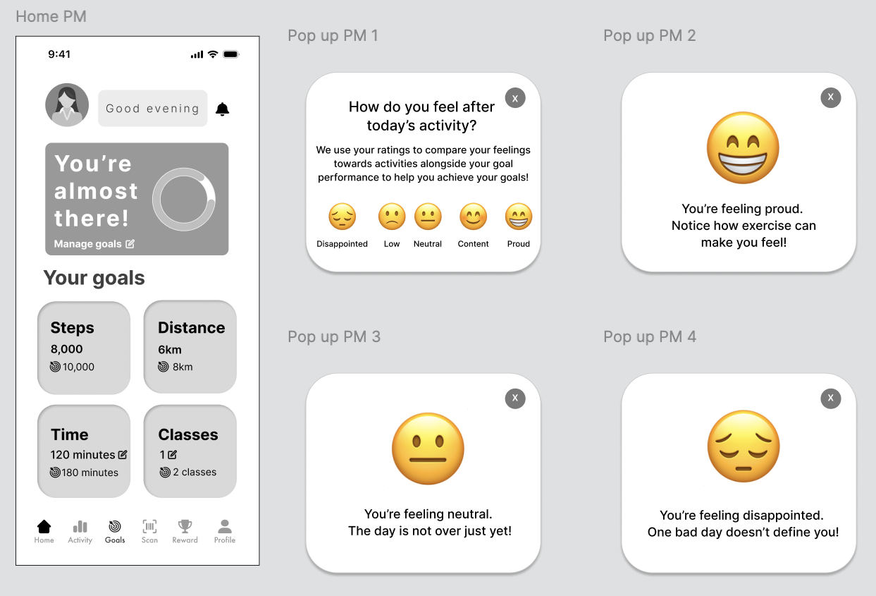
AM and PM pop up emotion ratings; the PM is prompted after viewing an activity later in the day
The goal check-in pop up with insights and suggestions
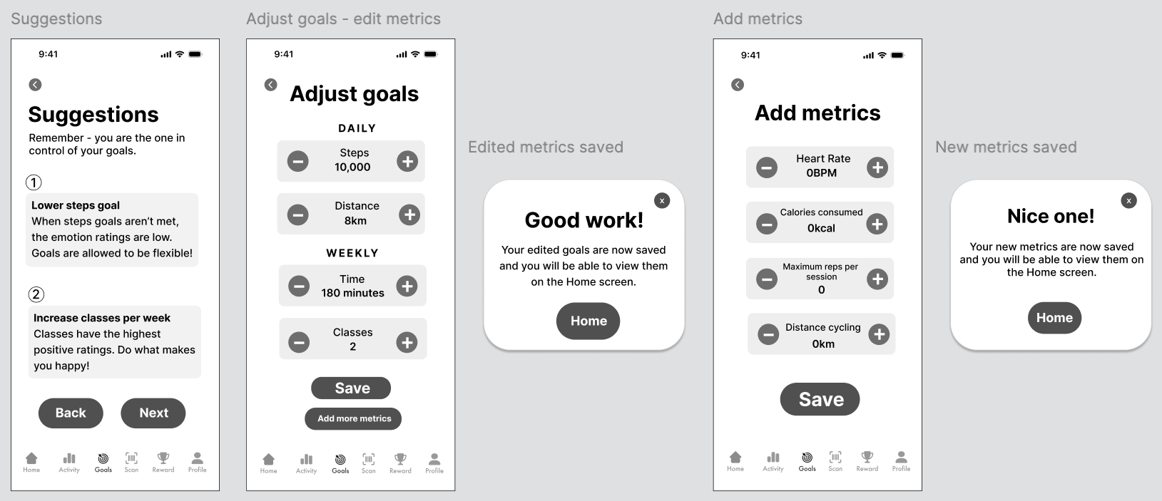
Phase 3
Applying a style guide, design principles, and all user research to create high-fidelity designs of the design solution.
This first flow depicts the morning check in, which pops up when the user first opens the app. The flow then moves to Notifcations which reminds the user to complete their monthly goal check in, which prompts them to see their insights regarding their goal completion aligned with their emotion ratings.
This second flow depicts the evening check in, where the user enters how they feel after completing the day's activities.
I chose the daytime/nightime colourways to evoke a gentle wakeup/wind down mood for each time of day, to align more closely with my mindfulness theme for this project.