Employer Project: information architecture solutions
For my final module for the Product Design Career Accelerator programme, I worked in a team of seven product designers to develop a proposed education hub for Salient Bio, a biotechnology company.
Project scope
Salient Bio commissioned us to design a new educational content hub that would integrate with its existing website and design system. The goal was to create a dedicated space for informational and educational content relating to its testing services.
The hub needed to be easy to navigate while helping customers understand why testing might be relevant to them. The content would support users throughout the testing journey, from collecting samples to understanding their results. Our primary focus was therefore the information architecture and overall user experience, while ensuring that the proposed designs remained consistent with the existing design system.
Methodology
We began by conducting a competitor analysis, which generated a wide range of insights to organise and synthesise before ideation. We used affinity mapping to identify recurring themes and inform our design decisions. We then created two empathy maps representing our main user groups: patients and clinicians. These findings helped us develop our problem statement and define what the education hub needed to achieve.
Problem statement:
Patients considering or using the company’s microbiome and pathology tests, and the clinicians who support them, lack a clear, centralised way to understand the purpose, process, results and next steps of testing. Because specialist diagnostics can feel technical, unfamiliar and difficult to interpret, users may struggle to judge whether testing is relevant, credible and useful at the point they need to make decisions.
There is an opportunity to design an educational hub that supports confidence across the testing journey by giving patients accessible guidance and clinicians evidence-based resources to help them explain, recommend and interpret the company’s services.
Ideation
User Flows
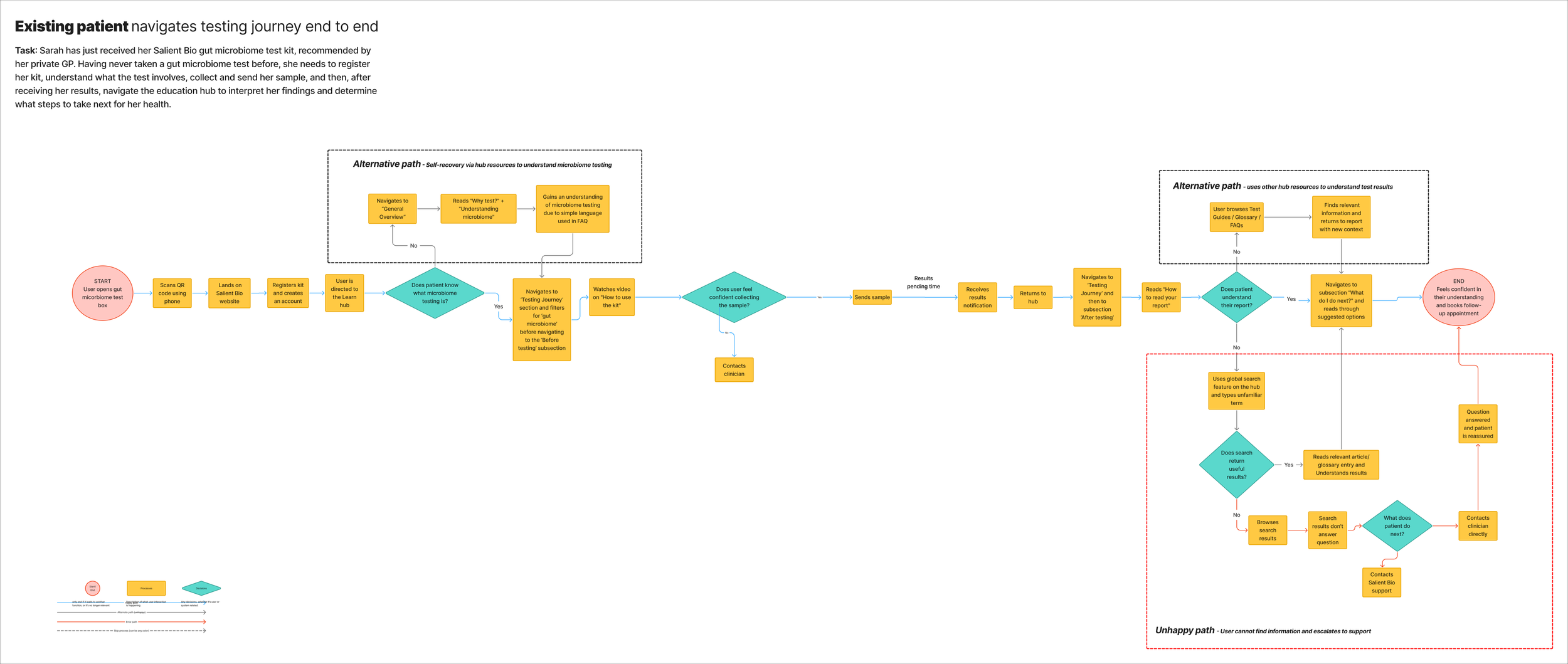
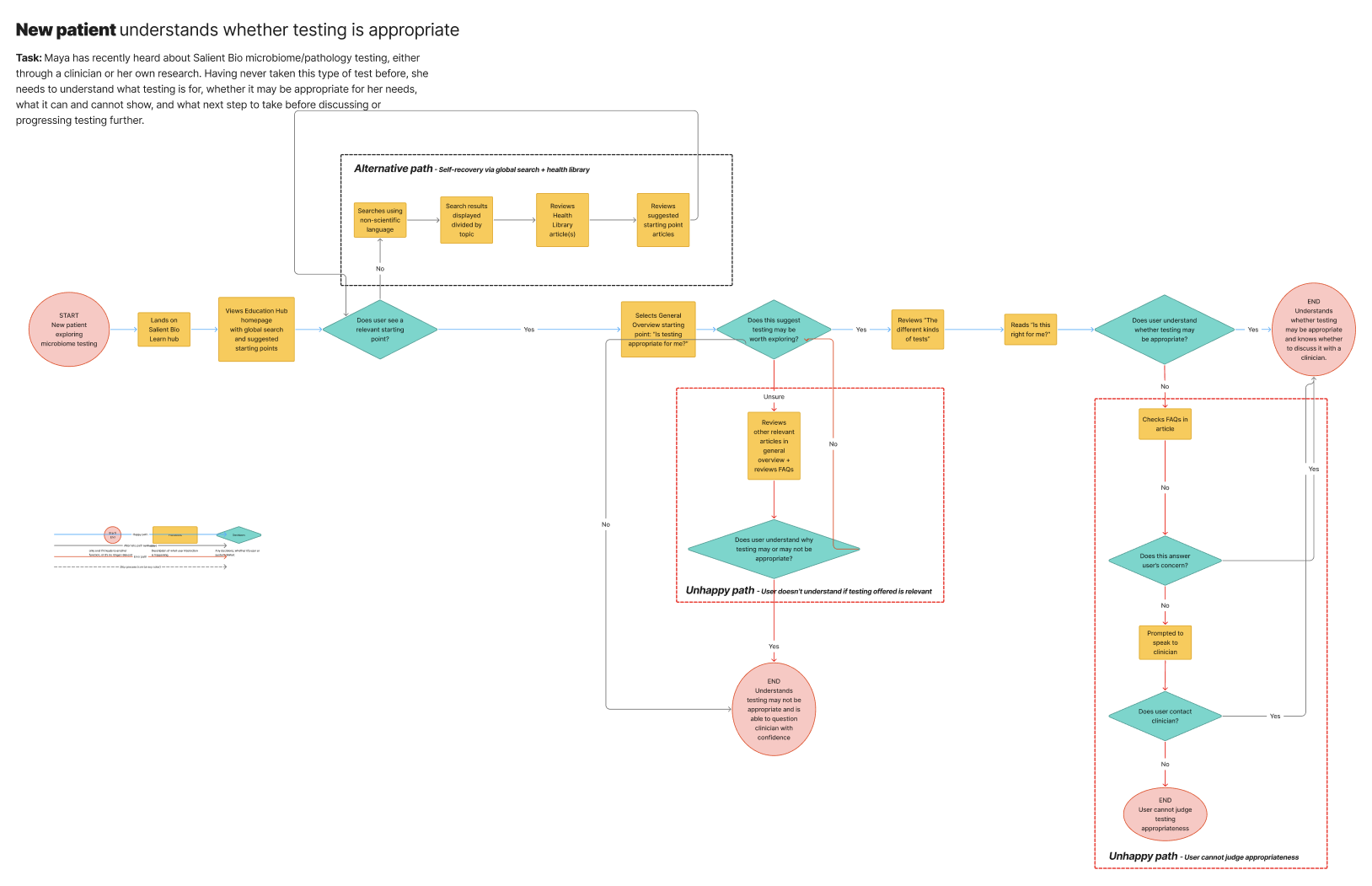
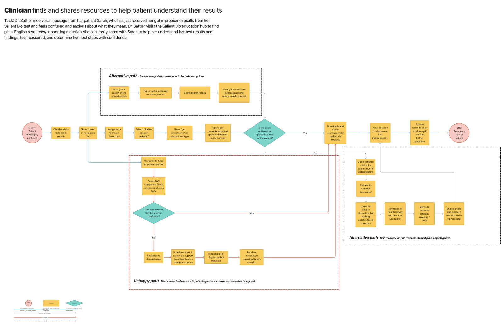
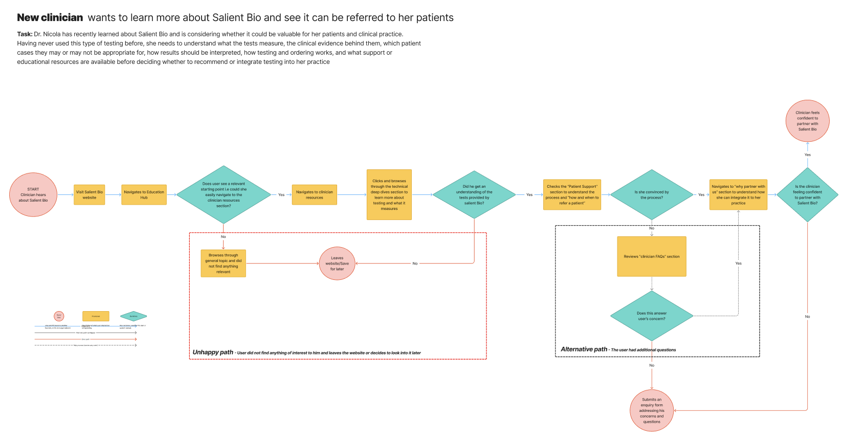
We then created four user flows representing the main user groups and relevant subgroups, helping us understand how different users might approach and navigate the proposed education hub.
Low-fidelity to mid-fidelity design
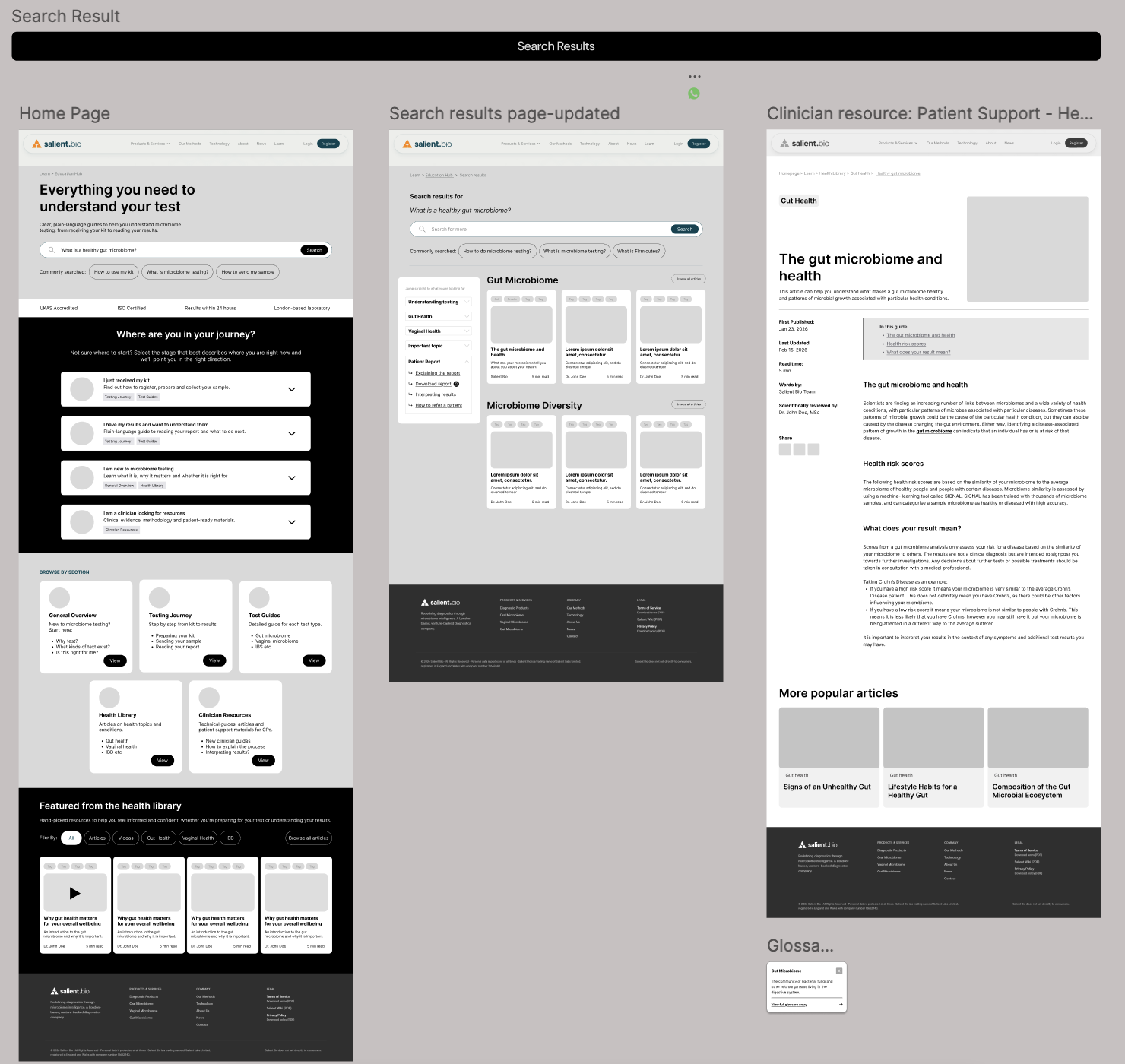
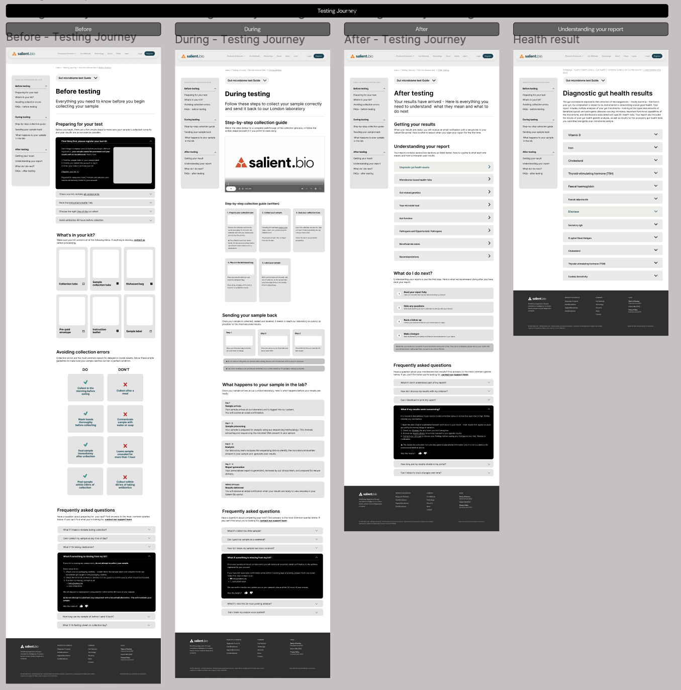
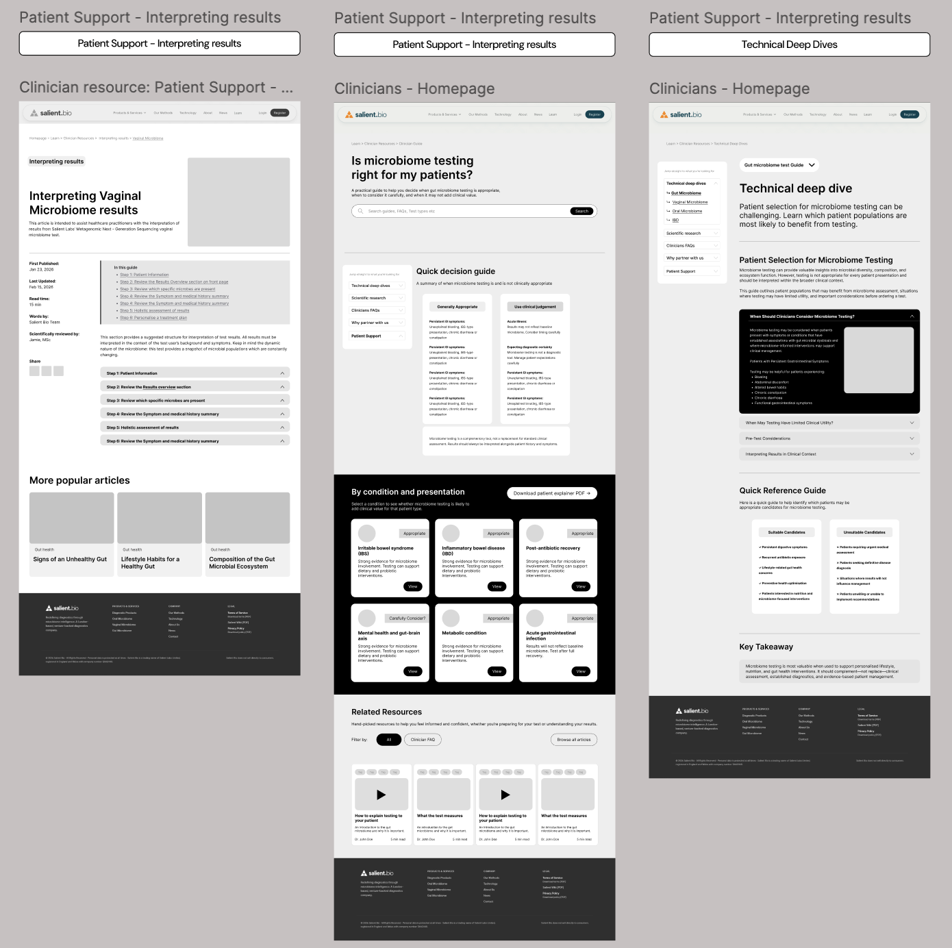
Our team created low fidelity greyscale wireframes to bring the proposed information architecture to life. Through team reviews and collaborative exercises, we developed these into mid fidelity designs ready for usability testing.
The below images show some examples of mid-fi wireframes of the screens used for usability testing.
Usability testing
Each usability testing session began with a short background interview to understand participants' existing knowledge of the subject, followed by five tasks. Our participants included users who would access the hub as a patient, and users who would access the hub as a clinician.
We organised participant feedback and quotes in FigJam, identifying areas where the designs could be improved before our final presentation to the client.
Information architecture
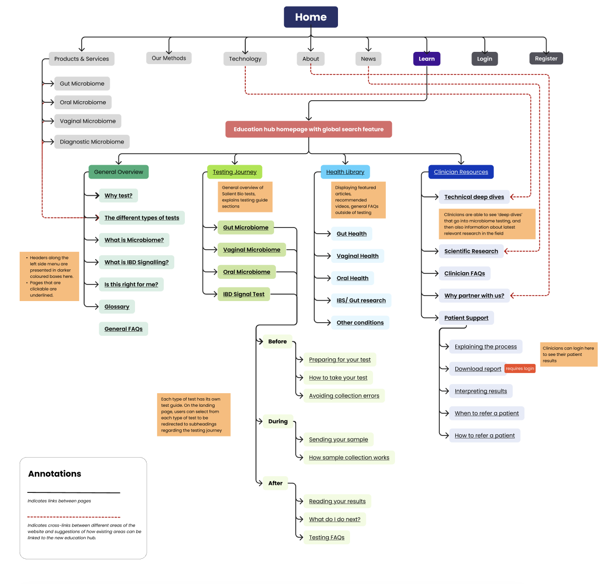
The final map shows the proposed structure of the education hub. We also developed a high fidelity prototype covering key areas of the website, which we presented to the client. The feedback was very positive and indicated that the proposed hub met the needs of both patients and clinicians, providing a clear, centralised way to understand the purpose, process, results and next steps of testing.
High-fidelity designs
The final designs build upon the team’s existing designs, but with edits to the information architecture of the ‘Learn’ hub based on our usability tests’ findings - this mainly included the positioning of the search bar, making the Health Library more obviously available, and a more detailed search result.
All content is placeholder copy.