Case Study: The Photographers’ Gallery
As part of my product design course, I was asked to identify and propose design optimisations for a website of my choice.
The Photographers' Gallery in London hosts photography exhibitions and events. It’s website allows visitors to explore what's on, book tickets and purchase merchandise.
I chose to focus on the ticket booking flow, with particular consideration given to accessibility and language for the gallery's international visitors.
Analysis of existing design of ticket booking user flow
It was unclear whether users needed to book a ticket for an individual exhibition or for general gallery entry.
Booking CTAs for paid exhibitions led to a screen where the calendar was small and the layout felt cramped, creating potential accessibility issues.
Ticket types were difficult to scan and the supporting copy did not clearly explain what each ticket included.
Available times were hidden within a drop down menu, making it difficult for users to see their options at a glance. The time selection also appeared after ticket type rather than directly after the date.
Users were required to create an account before checkout, with no option to continue as a guest. The payment screen was also visually inconsistent with the rest of the experience, which could affect user confidence.
So, what's the goal?
The main issues I identified were friction within the booking flow and the lack of a guest checkout option. Using the Jobs-to-be-Done framework, I defined the core user need as:
“As a potential visitor, I need to book a ticket for a specific date and time without creating an account.”
Usability testing plan
I conducted usability tests with two participants. Each session began with a short background interview, followed by tasks using the gallery's existing ticket booking flow and a series of follow up questions. Consent was obtained before each session began.
Interviewing
Do you go to art galleries?
Do you often go to see something specific, or just turn up?
How do you buy tickets?
Why do you want to book a ticket online?
When you book online, how far in advance do you tend to book?
Do you tend to browse first, or do you tend to visit the website when you know what you want to see?
Do you normally pay for exhibitions or prioritise free ones?
Tasks
Book a ticket for yourself to see an upcoming exhibition (not a free one). Get to the payment page but do not enter details/complete payment.
Try and add a new exhibition ticket to your basket.
Find general information on ticket prices.
Follow up
What were your general thoughts about the tasks?
Was it easy?
Did you understand what you were booking?
Results
The participants that took part in the guerrilla usability tests were culturally engaged, curious, and enjoyed art. Both participants regularly visited galleries in London and while travelling. Participant 1 tended to be more spontaneous and rarely booked online in advance, while Participant 2 preferred to plan ahead, research exhibitions and purchase tickets online.
Neither realised that one ticket grants access to all exhibitions on the same day.
Both found pricing unclear or misleading.
Both found it a confusing flow in terms of structure of the process of booking.
Both noted poorly structured ticket options where concession options were confusing.
Both noted they cannot return to Home by pressing logo.
Both found it a confusing and long-winded sign in process which disrupted flow.
Participant 2 felt some elements were misleading, i.e. that ticket prices are displayed incorrectly.
Participant 1 noted visual inconsistency in UI elements in each step in terms of button placement, etc.
Ideation: Low-fidelity wireframes
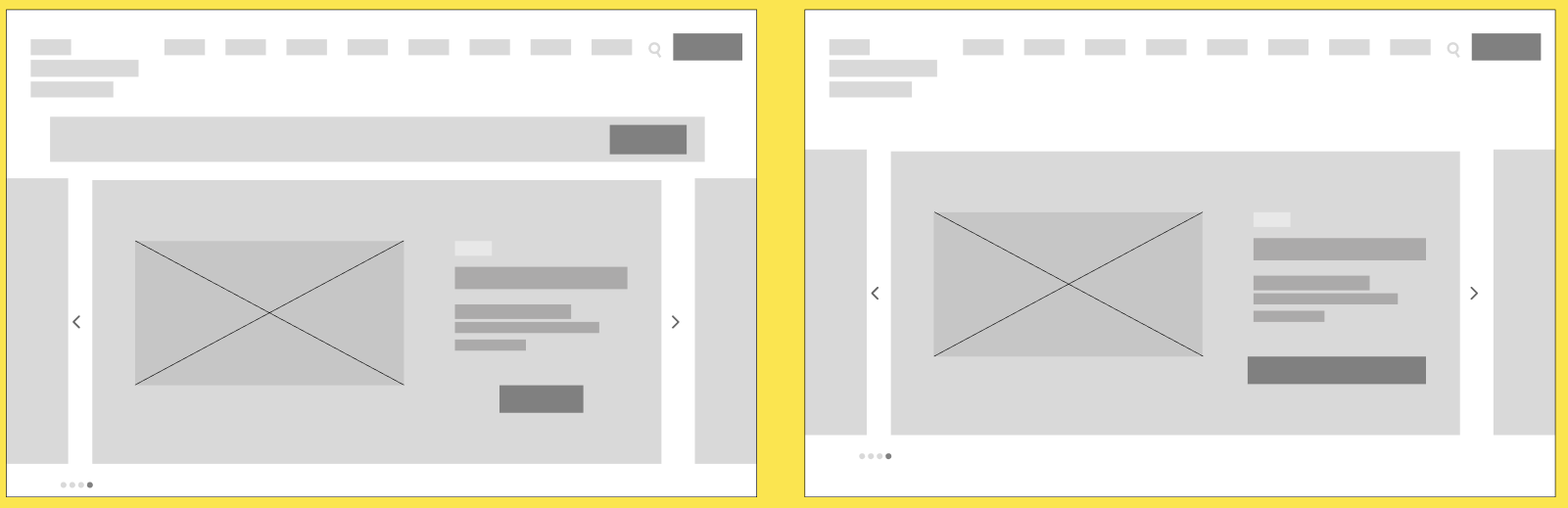
Homepage: repositioning the primary 'Book tickets' CTA
Selecting a time: exploring CTA placement and clearer ways to display available times
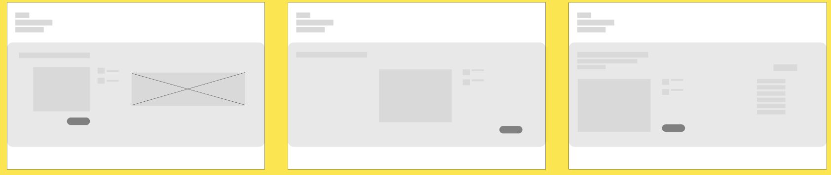
Selecting a date: exploring the placement of the calendar, imagery and supporting information
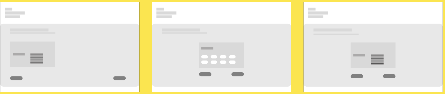
Selecting a ticket type: exploring clearer ways to display ticket options and prices

Basket summary
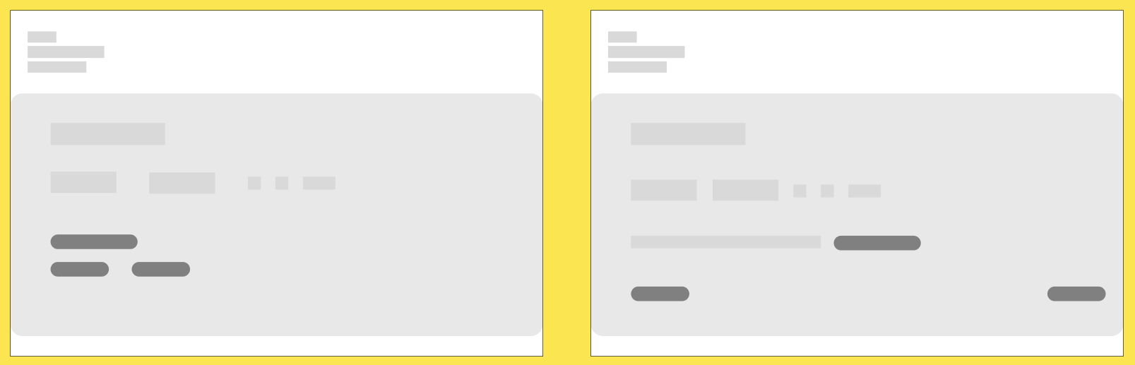
Checkout as guest

Confirmation screen
User flow
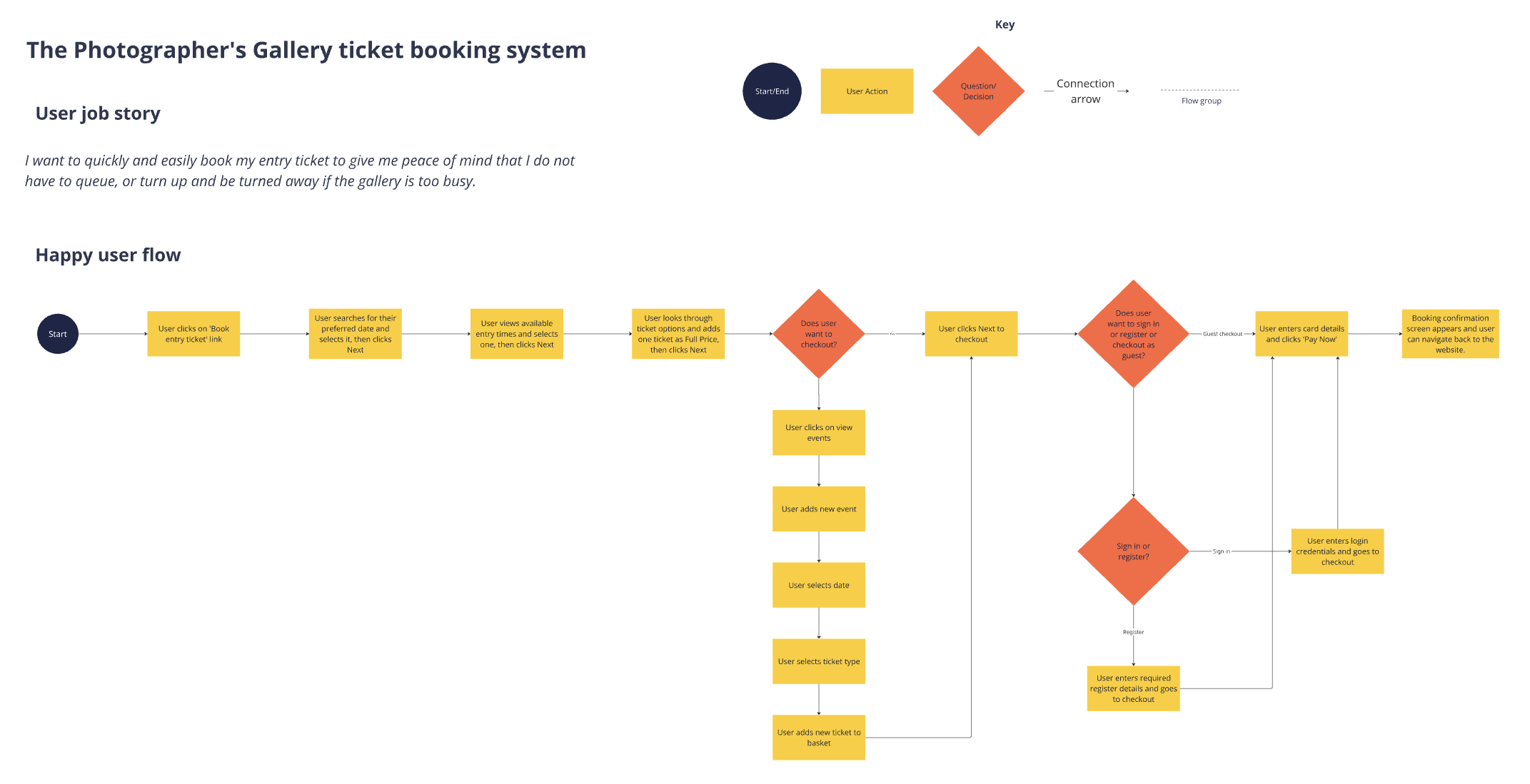
I created a user flow to map the ideal ticket booking journey and identify the decisions users would need to make at each stage.